
Most of the expensive surprises in a perfume launch happen on the bottle, not in the juice. The formula is sampled and tested for months, while the decoration is often approved from a screen capture in an afternoon — and that asymmetry is where the money goes. Every one of the six mistakes below is known in advance, costs nothing to avoid at the design stage, and costs a production batch to fix afterwards.
Key takeaways
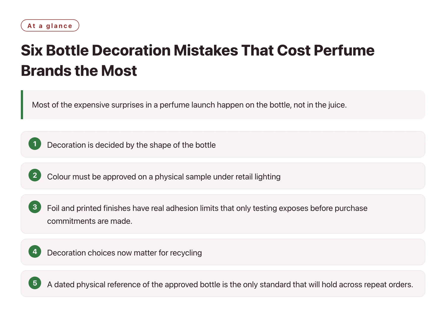
- Decoration is decided by the shape of the bottle, so it has to be designed with the glass, not after it.
- Colour must be approved on a physical sample under retail lighting, because screens and paper proofs mislead.
- Foil and printed finishes have real adhesion limits that only testing exposes before purchase commitments are made.
- Decoration choices now matter for recycling, which makes some visually attractive finishes a regulatory risk in the EU.
- A dated physical reference of the approved bottle is the only standard that will hold across repeat orders.
Every perfume buyer knows the smell of a failed launch: the brand looked right in the render, and the physical bottle looks slightly wrong. The colour is off, the foil is wearing, or the label sits too close to the pump to be read. None of these are formula problems, and all of them are decoration problems.
The pattern is consistent across projects because the underlying mistakes are consistent. Fix the six below and the decoration stops being the reason a batch gets reworked.
Mistake one: designing the glass before the decoration
A bottle shape is chosen for how it looks empty, and only later does someone discover it is difficult to print on. Curved panels, deep shoulders and textured glass all limit where ink and foil can sit, and shrinking the artwork to fit a frozen shape usually reads as an afterthought on the shelf.
The fix is to hand the decorator a drawing of the bottle with the print area marked at the same time the glass is being designed. A few millimetres of flat panel added in the drawing stage cost nothing; the same adjustment after the mould is cut costs a tooling revision.
This is one reason brands work with a single partner from the start. A one-stop fragrance manufacturing setup means the glass, the decoration and the cap come from teams that talk to each other, so the print area is negotiated before the mould exists rather than after.
Mistake two: trusting the screen and the paper proof
A Pantone reference is a starting point, not an outcome. Screen printing lays down a layer of ink whose final colour depends on the glass behind it, the number of passes and the opacity of the pigment, which is why the same grey looks warm on frosted glass and cold on clear glass.
Approve colour on a physical sample printed with the actual ink on the actual bottle, viewed under the lighting of the store where the product will be sold. That single habit eliminates most of the 'it looked different in the render' conversations at the first bulk order.
Mistake three: assuming every finish survives contact
Hot-stamped foil is brilliant on day one and can rub off in a handbag by week three. Painted and lacquered finishes are more durable but chip at the shoulder, and a bottle that lives on a bathroom shelf meets soap, alcohol and cleaning cloths that a lab blotter never encounters.
Ask the factory which tests cover the finish you want — rub, alcohol resistance, temperature cycling — and approve the sample only against results. Decorated perfume bottles are packaged goods that are touched, and only the factory knows how its own finishes perform under that condition.
Independent testing facilities cover the same ground for cosmetics packaging when a third party is wanted for auditability [1].
What the test options cover
| Test | What it exposes | Finish most at risk |
|---|---|---|
| Rub / crocking test | Foil and ink wearing off under friction | Hot-stamped foil on handled surfaces |
| Alcohol resistance | Ink dissolving or blooming on contact | Unsealed printed areas near the cap |
| Thermal cycling | Coating cracking between heat and cold | Lacquer and painted shoulders |
| Adhesion tape pull | Ink lifting off the glass | Poorly cured screen inks |
| Abrasion in logistics | Damage from bottle-to-bottle contact in packing | Protruding decoration details |
The table is not an instruction to run every test on every product — it is a menu to choose from based on how the bottle will actually be handled. A travel atomiser needs the abrasion test; a shelf-displayed extrait may not.
Mistake four: ignoring what happens to the bottle after the scent runs out
A decorated bottle is also a piece of packaging waste, and the EU has been moving packaging rules toward recyclability and design-for-recycling for years [2]. A heavily coated or metallised finish can make a glass bottle harder to sort and recycle, which is exactly the kind of detail a brand discovers when it is trying to print a recyclability claim.
The question is not whether decorated bottles can be recycled at all — it is which finishes survive the sorting stream, and the answer depends on the coating system and the labels used. Ask the factory for the recycling profile of the decoration system it recommends, before the finish is chosen, not after the pack artwork claims something the bottle cannot support.
Mistake five: approving without a reference standard
The approved first article is the only reliable standard for every later order. Without a dated, sealed physical reference held by both the brand and the factory, 'match the first batch' means two different things to two different people, and every reorder becomes a renegotiation.
Write the reference rule into the contract: one physical sample per product, dated, labelled with the batch, kept by both parties. Repeat orders are then a comparison against a physical object instead of an argument about memory.
Mistake six: changing artwork after the screens are cut
Screens, foils and coating masks are made for the artwork. Once they exist, a logo tweak means new screens, new proofs and a new lead time, and the cost lands in the calendar of a project that is already late. Freeze the artwork — logo, colour, placement — before tooling begins and reserve changes for the next product version.
None of these mistakes are exotic; they are the routine ones that recur across projects. The teams that avoid them are usually the ones that have already seen them happen — a manufacturer that has run decorated perfume lines for years, such as Xuelei Fragrances, will raise the durability and reference questions before the artwork is frozen, because for them these are settled process steps rather than discoveries.
All six mistakes share a single root: decoration was treated as the last step instead of the first. Move it next to the glass design, freeze the artwork early, approve on physical samples and keep the reference. The launch calendar and the budget will both thank you.
Sources
- SGS: Cosmetics, Personal Care & Household Testing —— Testing, inspection and certification services for cosmetics and personal care, including microbiological, stability and safety testing aligned with cosmetics GMP.
- European Commission: Packaging Waste and the PPWR —— EU rules on packaging and packaging waste, including the Packaging and Packaging Waste Regulation requirements on recyclability and design.
Frequently asked questions
Which decoration method is most common on perfume bottles?
Screen printing is the workhorse, and hot stamping is used for metallic accents — most fine fragrance bottles combine both. Spray coating and labels cover the rest. The method should follow the shape of the bottle and the durability needed, not the look of the render.
Why does the same artwork look different on the final bottle?
Because the colour is built on the glass, through the ink, under the coating, and every one of those layers changes the reading. Glass tint, opacity of the ink and lighting at the point of sale all shift the perceived colour, which is why approval should always happen on a physical sample.
Can decorated glass still be recycled?
Yes, but some finishes are harder to sort than others, and EU packaging rules now push strongly toward recyclability. Ask about the recycling profile of the decoration system before choosing the finish, and keep the answer consistent with any claim printed on the pack.
How do I keep decoration consistent between orders?
Hold a dated physical reference from the approved first article, keep it on both sides, and require each new batch to be approved against it. Colour tolerances should be written down too, so drift is measured rather than debated.
Who should run the durability tests?
The factory runs its own tests as part of development, and an independent laboratory can be used when the brand wants a third-party record for its file. Either way, the test method and pass criteria should be agreed in the specification, not chosen after the first complaint arrives.